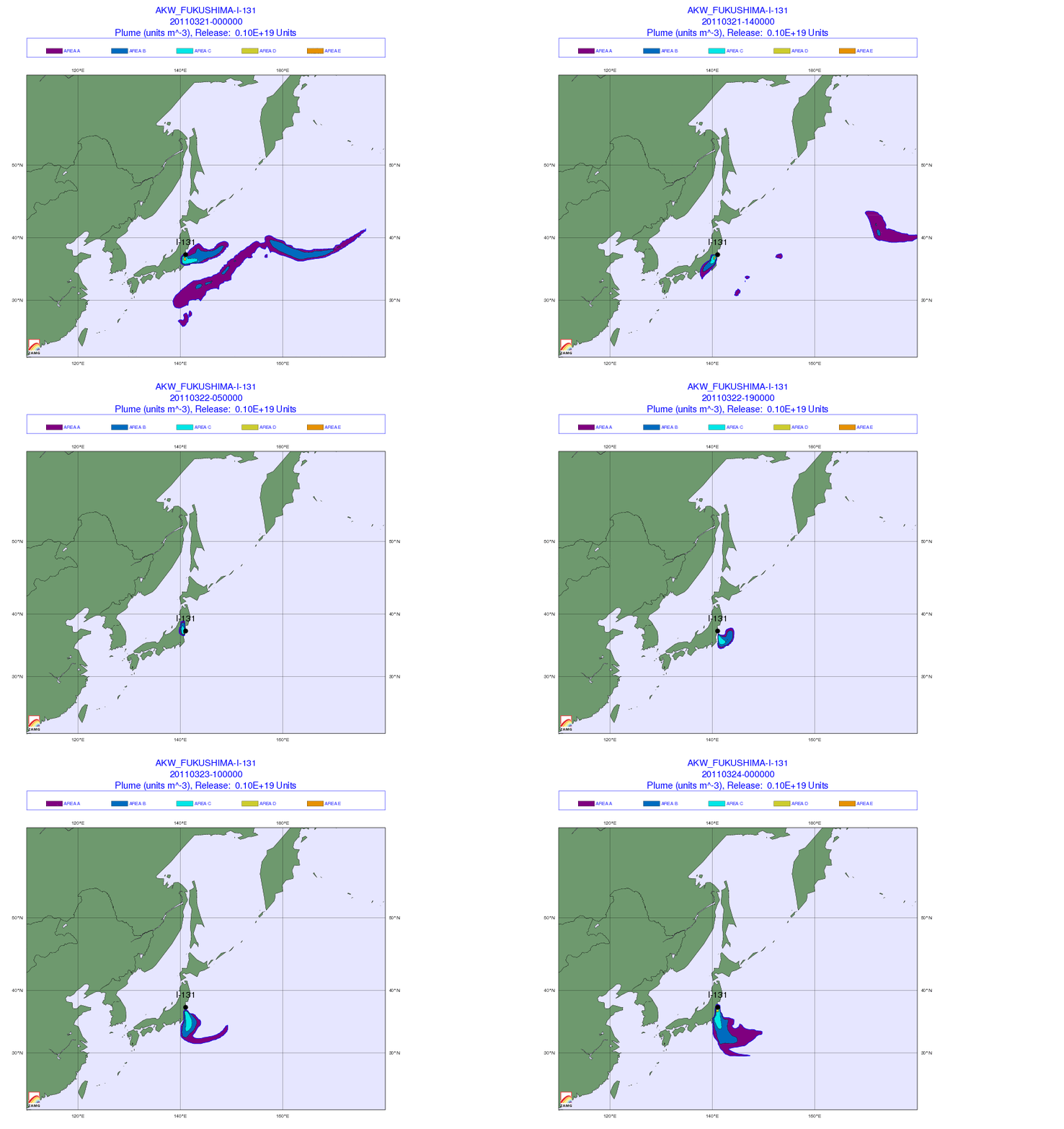
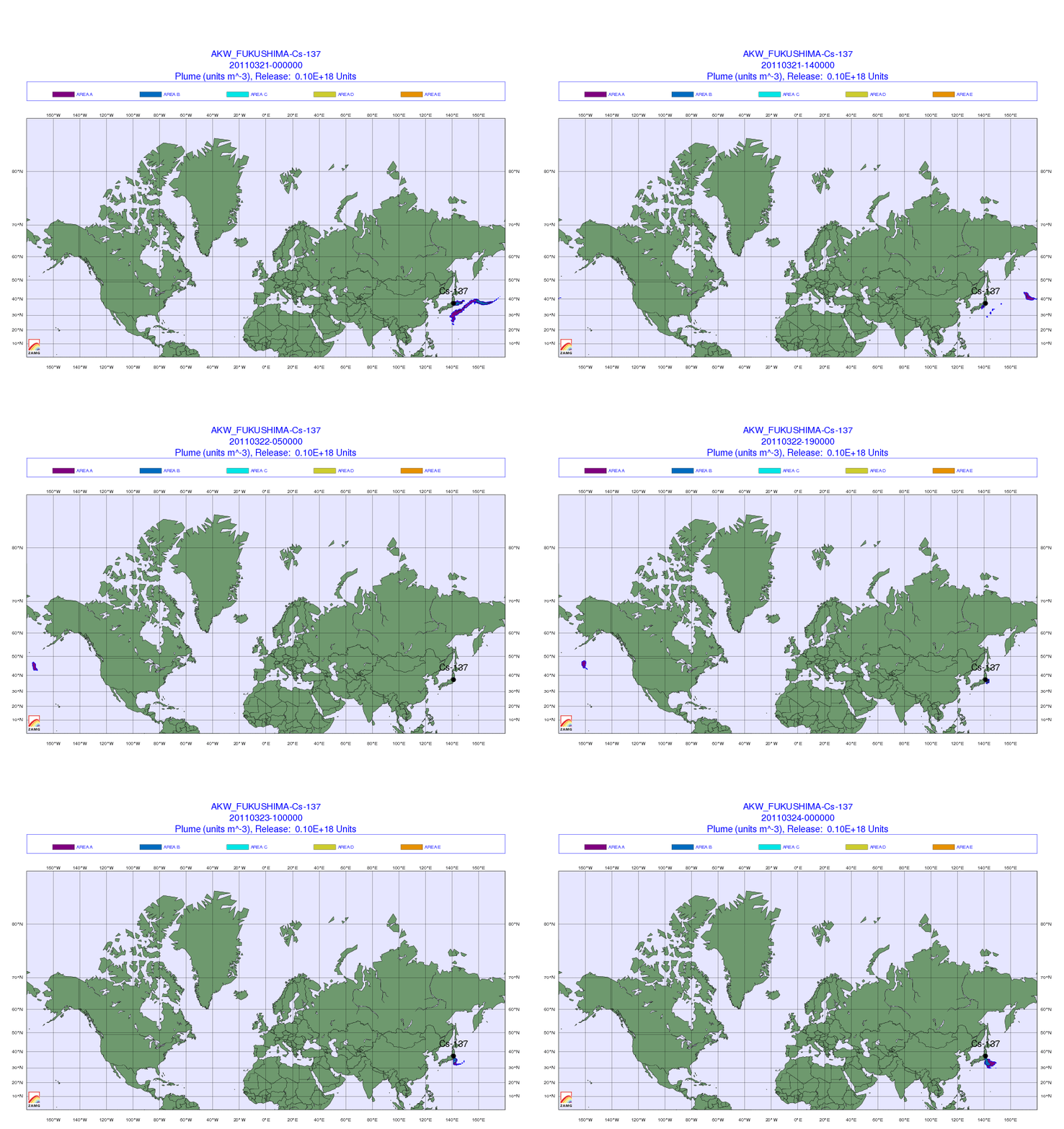
Below are several animated time-series maps showing the projected geographic dispersion of several radioactive elements coming from the Fukushima Nuclear disaster site. I discovered these in a recent post on the Zero Hedge site. The original source is the Central Institute for Meteorology and Geodynamics (ZAMG) based in Austria. A full English language document explaining the current situation and what the colors mean are at this link. Essentially, the further to the right on the color scale, the worse the fallout is. That said, ZAMG does clearly state “there is currently no health risk whatsoever” in areas outside Japan.
A projection of radioactive Xenon 133 which is now reaching Far Eastern Russia and North America.

A Projection of Radioactive Iodine 131 over Japan

A Projection of Radioactive Cesium 137 over the Pacific

Source: Central Institute for Meteorology and Geodynamics (ZAMG)
I haven’t seen these maps in the mainstream media yet. I’d be interesting in understanding more about the source data ZAMG is using for these projections and if that data is accurate or perhaps being under reported.
If we could get our hands on some of the resulting fallout dispersion polygons, we could load them up in GeoMetrx and run some reports to see how much of the US population is being exposed to these various types of radiation.
Stay Grounded,
Kent

